


OVERVIEW
Asp.Net MVC 4 has introduced many new features that supports mobile applications. It is very important for any site to have a user friendly mobile interface and a pleasant look. In order to make mobile applications specific ally for Android, Blackberry, windows phone, iOS etc… developers need to go to the application and write code for the required mobile application. However, all native applications need platform specific code and skill set.
The most common toolset used for making mobile applications are CSS3 and HTML5. It allows programmers to write code once and run it anywhere. HTML5 and CSS3 have become industry standards for browser based and multitargeted sites. The wonderful thing about HTML5 and CSS3 is that it is a simple markup that can be used on any HTML based toolset like PHP, Asp.Net MVC etc.
Asp.Net MVC 4 has added many new features having browser-agnostic concept of CSS3 and HTML5 that allows developers to easily develop applications aimed for both desktop browsers and mobile browsers.
Following are the new features that are added for mobile development in Asp.Net MVC 4.
- 1. Adaptive Rendering
Adaptive rendering refers to the process to display the websites differently according to the browser and the device capability. Asp.Net MVC4 has added many new techniques for adaptive rendering.
- Viewport Meta Tag
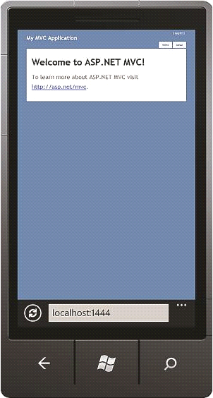
All browsers assume by default that the page is rendered on desktop even if they are on tablets and mobile devices. The content is displayed at 980 pixel width and zoomed out. Look at the figure above. The site is created in Asp.Net MVC 3 using the template as default Internet site. Inspite of being displayed in the mobile browser, it looks like it rendered on the desktop. The site does not seems to be an ideal site for the mobile applications.
In Asp.Net MVC 4, there is a tag called Viewport Meta tag. Using this tag, programmers need to specify the browser the height, width and the scale needed for rendering of the content. It is also possible to render the content according to the device capability.
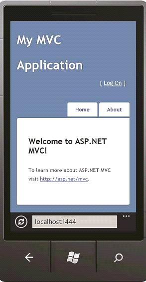
The above figure shows the site in which the viewport Meta tag is added in the _Layout.cshtml file. As shown above, the site is scaled according to the width of the device.
- CSS Media Queries
While creating a multitargeted site, it is often required to see a different view on the mobile site and the desktop site. The needed functionality is same on both the views, however the display and style of contents should be different. In Asp.Net MVC 4, programmers can write specific styles according to the browser capability using CSS Media Queries. Look at the example below:
@media only screen and (max-width: 800px) {
header{
float: left;
}
}
The above style will only be applied in case the media is screen and not the print and the area on which the site is rendered should be less than 800px. Using this technique, it is possible to create styles in different fashion as the capability of the browser.
Most of the project templates of Asp.Net MVC 4 includes CSS Media Queries examples. As a demonstration, create a new project of Asp.Net MVC4 with Internet Application as project template. Maximize the browser and then slowly reduce the window size. Look at the style and display of the page as soon as the window size is reached 800px or less.
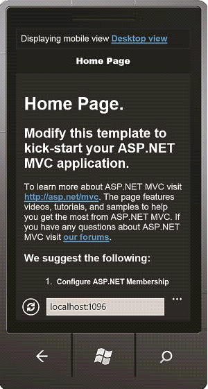
- JQuery Mobile
For making UI’s of mobile application in JQuery, there is an open source library called JQuery mobile. We cannot find JQuery mobile in any Asp.Net MVC application by default. It can be added from the Nuget packages. After installing the required files and scripts, go to the _Layout.cshtml folder and include the required CSS and script references. As an alternate, just install the JQuery.Mobile.MVC package. It will create a file named as _Layout.mobile.cshtml and add all required references. The Jquery.Mobile.MVC package adds the view-switching functionality as well that helps the users to switch to the desktop version from the mobile version.
- Project Template
A new project template has been added in Asp.Net MVC 4 named as “Mobile Application” template that allows user to create a standalone application that will specifically target the mobile browsers. By default, this project template implements the feature of Jquery mobile in all views.
The newly added Mobile Application template is very useful creating sites that target mobile browsers only. It can also be used for adding mobile-specific features in an already existing desktop application.
- Mobile Specific Views
Asp.Net MVC 4 allows programmers to override views for different mobile devices with the help of convention instead of configuration. When any request is being serviced from any mobile browser in Asp.Net MVC 4, then to determine the view to serve, it initially find all views with [view].mobile.cshtml as naming convention . If it finds a match, then that view will be served, else it will serve the standard view.
In order to serve for browser specific views, it is not necessary to serve these on desktop. Asp.Net MVC 4 has added a new feature called Display Modes to accomplish it. This functionality allows users to combine convention over configuration and the robustness of browser sniffing in order to serve the browser specific views. It is necessary to define the Display modes in Application_Start event of the Global.asax file in order to make use of it.
With the increasing demand of mobile applications, one of the main focus of Asp.Net MVC 4 was improving the Mobile development of websites.
Conclusion:
In this article asp.net development company explained Asp.Net MVC 4 added new features having browser agnostic concept of CSS3 and HTML5 for both mobile applications development and desktop applications development.
Johnny Morgan
Latest posts by Johnny Morgan (see all)
- Preview & Update Latest Version 15.3 Visual Studio 2017 - July 21, 2017
- Artificial Intelligence and CRM—A Match Made in Heaven - April 25, 2017
- How to Promote Mobility with Apache Hadoop? - April 5, 2017