


Material design has been introduced in Android 5.0. One can create good design in the app using material design. It is implemented using design library introduced by Google from Android. 5.0 ( Lollipop). You can follow the guidelines and the properties of the material design in the official Android developer Guide.
This post is going to cover few of the components of material design. Let’s start with the components of material design in Android.

Add in build.gradle :
 <pre  style="font-family:arial;font-size:12px;border:1px dashed #CCCCCC;width:99%;height:auto;overflow:auto;background:#f0f0f0;;background-image:URL(http://2.bp.blogspot.com/_z5ltvMQPaa8/SjJXr_U2YBI/AAAAAAAAAAM/46OqEP32CJ8/s320/codebg.gif);padding:0px;color:#000000;text-align:left;line-height:20px;"><code style="color:#000000;word-wrap:normal;"> dependencies {

   compile fileTree(include: ['*.jar'], dir: 'libs')

   testCompile 'junit:junit:4.12'

   compile 'com.android.support:appcompat-v7:X.X.X'

   compile 'com.android.support:design:24.X.X'

   compile 'com.android.support:support-v13:X.X.X'

 }

</code></pre>
-
Buttons
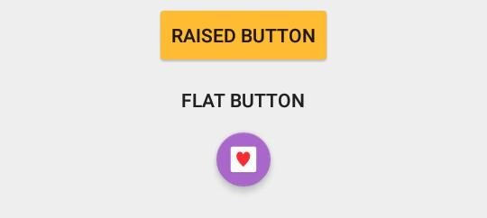
Buttons are of 3 types in Android i.e Flat, Raise and Floating button which are as mentioned below :
-
Flat
Flat buttons doesn’t have background. Button has only text. You can apply ripple effect on pressing the button. It’s mostly used in toolbars, dialogs or inlines.
In layout folder:
<pre style="font-family:arial;font-size:12px;border:1px dashed #CCCCCC;width:99%;height:auto;overflow:auto;background:#f0f0f0;;background-image:URL(http://2.bp.blogspot.com/_z5ltvMQPaa8/SjJXr_U2YBI/AAAAAAAAAAM/46OqEP32CJ8/s320/codebg.gif);padding:0px;color:#000000;text-align:left;line-height:20px;"><code style="color:#000000;word-wrap:normal;"> <Button android:id="@+id/btnRaised" android:layout_width="wrap_content" android:layout_height="wrap_content" android:text="Raised Button" android:theme="@style/RaisedButton" /> </code></pre>
Style :
<pre style="font-family:arial;font-size:12px;border:1px dashed #CCCCCC;width:99%;height:auto;overflow:auto;background:#f0f0f0;;background-image:URL(http://2.bp.blogspot.com/_z5ltvMQPaa8/SjJXr_U2YBI/AAAAAAAAAAM/46OqEP32CJ8/s320/codebg.gif);padding:0px;color:#000000;text-align:left;line-height:20px;"><code style="color:#000000;word-wrap:normal;"> <style name="RaisedButton" parent="Theme.AppCompat.Light"> <item name="colorControlHighlight">@android:color/holo_purple</item> <item name="colorButtonNormal">@android:color/holo_orange_light</item> </style> </code></pre>
-
Raised
It is rectangular shaped button. It’s raised button with background color. You can change the background color on button press.
In layout folder:
<pre style="font-family:arial;font-size:12px;border:1px dashed #CCCCCC;width:99%;height:auto;overflow:auto;background:#f0f0f0;;background-image:URL(http://2.bp.blogspot.com/_z5ltvMQPaa8/SjJXr_U2YBI/AAAAAAAAAAM/46OqEP32CJ8/s320/codebg.gif);padding:0px;color:#000000;text-align:left;line-height:20px;"><code style="color:#000000;word-wrap:normal;"> <Button android:id="@+id/btnRaised" android:layout_width="wrap_content" android:layout_height="wrap_content" android:text="Raised Button" android:theme="@style/RaisedButton" /> </code></pre>
Style :
<pre style="font-family:arial;font-size:12px;border:1px dashed #CCCCCC;width:99%;height:auto;overflow:auto;background:#f0f0f0;;background-image:URL(http://2.bp.blogspot.com/_z5ltvMQPaa8/SjJXr_U2YBI/AAAAAAAAAAM/46OqEP32CJ8/s320/codebg.gif);padding:0px;color:#000000;text-align:left;line-height:20px;"><code style="color:#000000;word-wrap:normal;"> <style name="RaisedButton" parent="Theme.AppCompat.Light"> <item name="colorControlHighlight">@android:color/holo_purple</item> <item name="colorButtonNormal">@android:color/holo_orange_light</item> </style> </code></pre>
-
Floating
Floating buttons are action button which are circular in shape. It is generally on the right bottom corner of the screen to perform quick actions. You can change the background and shape of the buttons with properties.
In layout folder:
<pre style="font-family:arial;font-size:12px;border:1px dashed #CCCCCC;width:99%;height:auto;overflow:auto;background:#f0f0f0;;background-image:URL(http://2.bp.blogspot.com/_z5ltvMQPaa8/SjJXr_U2YBI/AAAAAAAAAAM/46OqEP32CJ8/s320/codebg.gif);padding:0px;color:#000000;text-align:left;line-height:20px;"><code style="color:#000000;word-wrap:normal;"> <android.support.design.widget.FloatingActionButton android:layout_width="wrap_content" android:layout_height="wrap_content" app:fabSize="mini" android:theme="@style/FloatingButton" app:rippleColor="@android:color/darker_gray" android:src="@mipmap/ic_call" /> </code></pre>
Style :
<pre style="font-family:arial;font-size:12px;border:1px dashed #CCCCCC;width:99%;height:auto;overflow:auto;background:#f0f0f0;;background-image:URL(http://2.bp.blogspot.com/_z5ltvMQPaa8/SjJXr_U2YBI/AAAAAAAAAAM/46OqEP32CJ8/s320/codebg.gif);padding:0px;color:#000000;text-align:left;line-height:20px;"><code style="color:#000000;word-wrap:normal;"> <style name="FloatingButton" parent="Theme.AppCompat.Light"> <item name="colorAccent">@android:color/holo_purple</item> </style> </code></pre>
-
Bottom Sheets
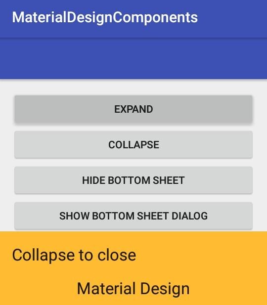
Bottom sheets basically slides from bottom to the top. BottomSheetBehavior class is used for creating bottom sheets. It contains child layout and child layout contains the content which is to be shown on expanded and collapsed view.. The different states of Bottomsheets are as follows :
– STATE_COLLAPSED
– STATE_DRAGGING
– STATE_EXPANDED
– STATE_HIDDEN
– STATE_SETTLING
In layout folder:
<pre style="font-family:arial;font-size:12px;border:1px dashed #CCCCCC;width:99%;height:auto;overflow:auto;background:#f0f0f0;;background-image:URL(http://2.bp.blogspot.com/_z5ltvMQPaa8/SjJXr_U2YBI/AAAAAAAAAAM/46OqEP32CJ8/s320/codebg.gif);padding:0px;color:#000000;text-align:left;line-height:20px;"><code style="color:#000000;word-wrap:normal;"> <?xml version="1.0" encoding="utf-8"?> <android.support.design.widget.CoordinatorLayout xmlns:android="http://schemas.android.com/apk/res/android" xmlns:app="http://schemas.android.com/apk/res-auto" xmlns:tools="http://schemas.android.com/tools" android:layout_width="match_parent" android:layout_height="match_parent" android:fitsSystemWindows="true" > <!-- Bottom Sheet Content --> <include layout="@layout/bottom_sheets_layout" /> </android.support.design.widget.CoordinatorLayout> </code></pre>
-
DialogBox
- Alert
- Confirmation
-
Selection Components
- Radio Button
- Checkbox
Conclusion:
These are the pro explanation for how to implement Material Design Components in Android app development. All coding examples has been tested by android developers at Nex Mobility.

Rosina De Palma
Latest posts by Rosina De Palma (see all)
- Why Enterprise Mobility Solutions Is Important in the Banking Industry - July 5, 2022
- Use Your Great Optimization Skills To Get Found In App Store - July 6, 2017
- This Is What Developers Should Know About iOS 10 - June 12, 2017